From Dated Blue to In the Mood for Romance!
It's all about You and the Hue! In my work as an Intuitive Interior Decorator, I'm also a Color Intuitive. A lot of what I discuss about what I see in the aura colors around each person, are the same topics discussed in Color Design, which are: Hue, Tint, Tone and Shade.
When I say for example that I see blue in someone's aura, I have to explain the exact color of blue that I'm seeing. There is a dark muddy shady of blue that can show that a person has closed themselves off to the world and to new ideas. That dark blue is very different from navy blue, which shows stability and reliability. A light bright blue can indicate communication coming from the spirit realms and a medium solid blue is what I call true blue, that really reflects the best energy that blue has to offer.
It's important to understand the shades and hue of color, along with the emotional and intuitive intelligence connected to each ray of color. When I meet with clients who are not happy with the color they've painted their walls, 90% of the time it's because they've picked a color they like in general, without understanding that the shade or hue of that color won't work well in their specific room.
For most of you here reading this article, you're not interested in the long winded academic explanation of color design, you're just looking for a quick guide to understanding how to pick the right colors for your home. So let me show you an example here of how the color blue, loved by two people, can go horribly wrong and how I helped to fixed it.
In this example, both the husband and wife were in complete agreement that they loved the color blue and wanted blue to be the color in their dining room. Easy peasy right? They agree blue is their color of choice, they both love traditional style decor and they agreed they wanted something that looked like it might belong in an old English home. This is where things began to go terribly wrong...
Even though the couple thought they were communicating well in their interior design discussion, they didn't share what shade of blue they wanted for the room. They also were just focused on what they loved and had seen in magazines, without having the understanding that what they saw in a magazine was created in a very different style room, that was much grander with windows on two walls and different entry points. If you're a hair stylist, you're familiar with this concept, when someone brings in a photo of a hair style they want you to give them, and it's up to you to explain how very different this style will look on their face with their face shape and bone structure, than how it looks on the model in the magazine.
The dining room itself was a lovely room, but could not accommodate a large table like in the photo and it only had one window, whereas in the photo of the traditional English home, the table accommodated twelve people with plenty of extra room and the windows covered two sides of the room from floor to ceiling.
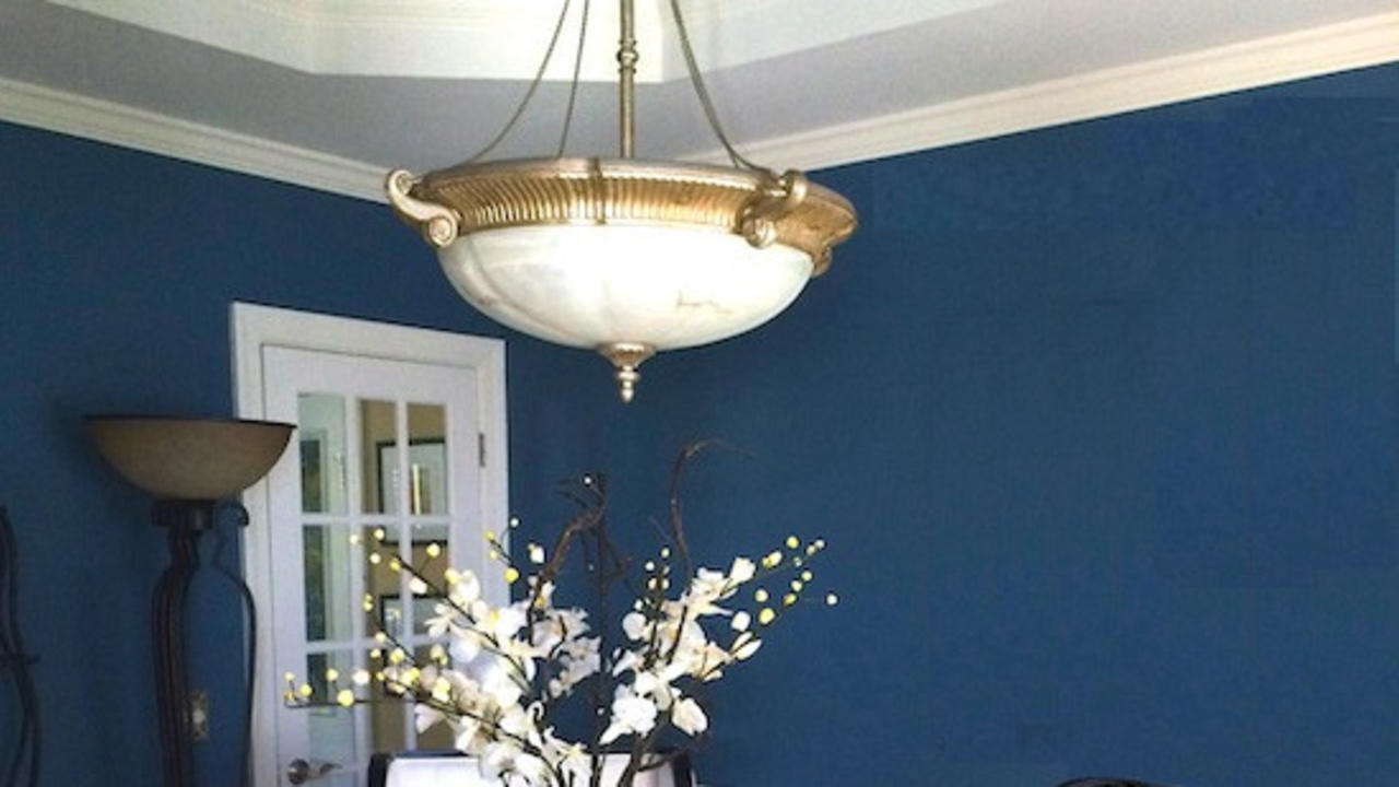
The couple went to purchase paint and to the wife's surprise, the husband wanted a deep navy blue. He felt that this was the right color for a traditional home. She resisted this choice, she had pictured a very light sky blue in the room. He was not interested in this color at all, calling it pastel and too feminine. They argued and then compromised. He would get to paint the color of his choice below the chair railing in the room and she would get to decorate the walls above the chair rail. She decided to counteract his dark color by choosing a wallpaper that was very light and had hints of blue in the floral design.
They put the room together and then, neither one liked it. They found they didn't want to spend time in the room and that it didn't reflect either of their tastes, nor did it feel like the room they wanted. They realized they couldn't capture the feeling from the magazine photo they loved. This is where they were in their design process when I was first introduced to the room.

(This was their design, his navy on the bottom, her use of color in the wallpaper up top and a brass chandelier that they had hoped would create that soft reflective glow of candlelight, that instead made the room feel more dated and gloomy)
I could see that their aura colors were very similar and that they were a compatible couple who could easily agree on things. Their blocking point had been not paying attention to the home they were living in. Each home has a story to tell and a distinct personality. I explained that they were not living in an old English home, they were living in a home that is described as Contemporary and to get a look that would feel pleasing and harmonious, they would need to be in balance and in touch with the energy and design of the home.
Through our Couples Decor Consulting conversations, I was able to intuitively read them and found along the way that what they really liked was the romantic feeling of what old Europe meant to them, and that it was soft reflection of candlelight, the eclectic collection of things from around the world that the Victorians loved to display and a dash of color to create a mood when entering a different room. Through our consultations together, they also shared that what they wanted most from this room was to create a space where family and friends could gather and talk and share a meal while having long discussions about topics of interest long into the evening over cocktails.
I was blown away when they shared this intention, because their intuition was guiding them in the complete right direction with their choice of blue as the color! They had not read my The Awakened Aura book, which describes what each color means. I was so excited that I shared with them right away what the color blue means when used in home decor. Here is the mantra that I have clients say as they decorate with blue:
Mantra to Balance Blue in Your Aura: I trust that my words are clear and spoken with true intent. When I speak, others hear and acknowledge my thoughts and words and receive them with ease. I am dignified and intelligent and trust that there is a divine plan, taking place at this time. My thoughts are clear, my mind is open to receive and beneficial information is coming to me every day to guide me in my work. – Kala Ambrose
They absolutely had been intuitively guided to put blue in their dining room to achieve the outcome they wanted, of having wonderful conversations in this room. They just needed help creating the right flow and shade of blue in this room to bring it all together.
Through our discussions, we agreed to meet in the middle between navy blue and light blue with a enlightened color that would set the tone in the room. This color would need to stimulate true blue communicative energy that would reflect and move like waves of oceanic energy around the room. How would this be accomplished? I had an idea of my sleeve that I thought would be just the thing!
I purchased ground quartz crystal, crystal that has been ground into tiny pieces that look like sand, found at Lowes. We added this ground crystal into the paint, first by holding the bag of crystal in our hands and putting energy into the crystals as to what we want to room to feel like. Then stirring well, the crystals were poured into the paint can.
We focused on what intention the room should have, which for this room was stimulating conversations, fun parties and gatherings, and romance. As we began to paint each wall, we first lightly painted a word on each wall reflecting this energy; romance, love, celebrate and share!
(When doing this, lightly paint the word and then using your roller, roll quickly over the words before they dry. You don't want to see the words bleeding through the paint, they are to remain invisible, only you will know they are there).
During this process, the husband had realized he didn't like the dark navy color in the room and that he liked the white background color in the wallpaper his wife had chosen, so the choice was made to keep a white color below the chair rail instead of adding a second color. This allowed the focus to remain on the soulful blue energy color they had created with the crystals and for the hardwood floors and the beautiful trey ceiling in the room to be highlighted.
Orchids were introduced to the room, along with art with a hint of France. New wing back chairs brought an eclectic feel to what the couple loved, allowing them to create a "feeling" of things they loved, while co-existing well in the contemporary style of this room. The chairs were very comfortable, creating a cozy environment to linger for long talks into the night with friends.
The romantic feeling was felt by day but at night is when it really came alive. The crystals in the paint created a reflective sheen that looked like light infused into wall as it shimmered around the room. The result was a mood enhancing romantic feel that made everyone in the room feel like they were somewhere magical, where conversations and the time together created special memories. It's like being away on vacation when you find one of those local favorite restaurants where time moves slowly and you don't want the evening to ever end. It's difficult to photograph how these walls shine and twinkle at night, the effect is like having a bit of starlight in the room or gazing at the ocean at night under the light of a full moon.
Ok, here's some pics of the room to see the transformative process:
1. Walls are painted (Sherwin-Williams Endless Sea) and brass chandelier has been replaced with a silver hanging light with a white alabaster dome. (I'll be talking about the metaphysical aura enhancing properties in alabaster in future blog posts, but take note, cause they are amazing!) A big vase of orchids (orchids were very popular in Victorian times and symbolize love, beauty and luxury) are ready for the table and a piece of art that reflects a french cafe chosen by the couple is introduced. The chairs are temporary from around the home to use until the new wing back chairs arrive.

2.Wall sconces that match the new chandelier are added into the room, along with buffet lamps. Light is used around the room to activate the sheen of the ground quartz crystal in the paint. The couple is very happy with their shared love and compromise of paint color which isn't too dark or light and a balance of masculine and feminine. The orchids bring in a feminine touch that also harkens to Victorian decor, while the iron base of the table and the black vase for the orchids anchor them with a masculine touch that also hints of old European balconies and design. The copper plant stand brings in some warmth and is used to hold an old world style champagne bucket that can be moved around at dinner parties and ties in with the french artwork on the other wall. Starfish are scattered around the room, representing the ancient wisdom teaching of "as above, so below", representing the stars in the sky above and the starfish (star of the sea) in the ocean below, both reflecting this sacred space. The starfish is a symbol of divine love.

3. The contemporary wing back chairs have arrived, tying in the black and white accents in the room, and eclectic art and decor continue around the room. The throw pillows reflect the Victorian style mix of patterns and colors and the artwork compliments the warm tones of the art on the other walls with an aged look that again is reminiscent of Victorian style, but yet more eclectic with a french country twist.
Cowrie shells are sprinkled around the room next to the starfish, again in the Victorian style of displaying collections from travels around the world, however in this case, the cowrie shells are also placed carefully in a circle around the table. The metaphysical meaning of the cowrie shell is protection and placed in a circle around the table, their energy creates an environment of safe protected space, where one can share their thoughts and opinions in discussions around this table and feel respected and heard with no judgment.

4. The beautiful trey ceiling had the popcorn effect removed from the ceiling, and the interior of the trey was painted in a lighter shade of blue (Sherwin-Williams Bluesy Note) to reflect the color around the room and center it over the table. Black iron floor lamps, also with alabaster shades, in the background coordinate with the overhead lighting, spreading more light energy around the room.

I hope this journey gives you some ideas on how to focus in on the exact hue and shade of color that will work in a room you are ready to decorate.

I also hope it inspires you to add ground quartz into the paint in a room The ground quartz crystal can be found at Lowes. Follow the instructions on how to add to the paint and note that once you pour it in, you'll need to paint the walls immediately, don't take a break and let it dry or it will clump and not turn out the same.
If you do, send me a pic, I'd love to see it. Also remember, it takes focused lighting in the room that hits the walls in order to really see the sheen.
For more tips on how to intuitively decorate your home and tap into your aura colors, Subscribe to my Free Newsletter, see the link below, where you'll receive all of these tips and offers for online courses and my intuitive interior decorator consultations.

ReDesign Your Life From the Inside Out!
Kala shares how mystical spirituality and intuitive awareness can help you live your best life.
Subscribe to her Free Newsletter for Tips on How to Intuitively Decorate Your Home and How to ReDesign Your Life from the inside out, one step at a time.
ReDesign Your Life from the Inside Out!
Kala shares how mystical spirituality and intuitive awareness can help you live your best life. Subscribe to her Free Newsletter for Tips on How to Intuitively Decorate Your Home and How to ReDesign Your Life from the inside out, one step at a time.
Author

Kala Ambrose
Author, Intuitive Interior Decorator and Wisdom Teacher
Kala Ambrose is considered one of the country's foremost experts on mystic spirituality and intuitive ability. She has taught thousands around the world how to create a life through conscious intuitive awareness that is in tune with their life purpose and goals. Welcome to her Academy of Mystical Arts & Spiritual Sciences.
Recent Posts
Categories
All Categories